


Growing up, I really enjoyed listening to K-Pop. Something about Korean, the language itself is very tongue-in-cheek, somewhat catchy and easy to mimic. I remember singing all the words to Gangnam Style when I was small and that was the very first essence of K-Pop music in my life. Later on, I was amazed at how highly entertaining the music was: not only because of good-looking idols and catchy songs, but also the art direction as well as the art of storytelling.
Not just the visuals, but they also focus on how the physical CD looks: instead of just a CD and a booklet packed in a jewel case, they also include photobooks, photocards, lyrics papers, and stickers,… Besides, I am quite keen on experimenting with packaging design. I am fully aware that this is a big project, in which I will have plenty of time to demonstrate my graphics designing skills in a music industry/marketing context. I will take inspiration from fellow creative directors in the K-Pop industry and interpret my own ideas.
This will be a multi-media project where I direct my own made-up band and produce their first album. This includes:
•Brand identity
•Art direction for the album’s concept (photography-based)
•Photobook includes the photos and lyrics, as well as graphics
•Freebies: photocard, stickers, poster
•CD design, using mock-up
•Packaging design for the album


The process of creating the group's concept
The reason why I took time to look for inspiration is because these themes will decide the aesthetic choice of the album. Once I have decided on the storyline of the project, it will be easier for me to link it up with iconographies, colours, and photography styles.
Here’s a sum up of Fallen Angel’s narrative: Ethan and Meg are the young angels of the Moon, but they decided to go down to earth after betraying the wishes of God, that they have to live on the moon for the rest of their life, doing the same old thing every day, which is protecting people on Earth, while they just feel like every other angels. Going against their fate, they decided to secretly escape from the Moon by casting an “Solar eclipse ritual”, when the sun, the moon, and Earth align together and when the Moon God can’t see anything, they can escape down to Earth. But the eclipse couldn’t last forever, after the event, the Moon God noticed that Ethan and Megan were gone so he looked for them anywhere. Meanwhile, although the moon angels know that they can’t be on earth forever, they want to taste what freedom, fun, and youth feel like.

Mega workspace for the project. Including mood boards, colour palettes, and inspirations

Contact Sheet

Official Album Cover (Digital version)
For the album cover mocks, I base everything around the logo of the group and of the album. I tried to crop the album cover to make it fit the screen or tried to make it smaller and blurrier to make space for the text. I don’t think the black one is suitable for an album cover since it doesn’t offer the context/concept as the casefile one. Also, this is the attempt for the digital version so I have two directions: to include texts or not, and you can see that I tried both options with different text layouts.
The color pink is very cute so I want to see it on the cover, but it’s hard for it to stand out on a background which features too many details like that, so I need a solution
I got all the types I wanted in and started to think about what colour would compliment the colour pink, and I edited the album cover to be green. After that, I made the album title glow up and added the grunge print effect to every other text.
To me, this cover looks very digital as nowadays texts are usually sans-serif. Another thing that I like about this cover is its layout of text: we have the biggest text in the bottom half being the album name, a big bold san-serif in the top left for the group name, and smaller texts on the top right to give the cover an overall harmony.

Details of inclusions for the Cassette version.

Details of inclusions for the Digipack version.

Details of inclusions in the Photobook version.

Details of inclusions in the Vinyl version.

Album release announcement - Poster

Tracklist Poster
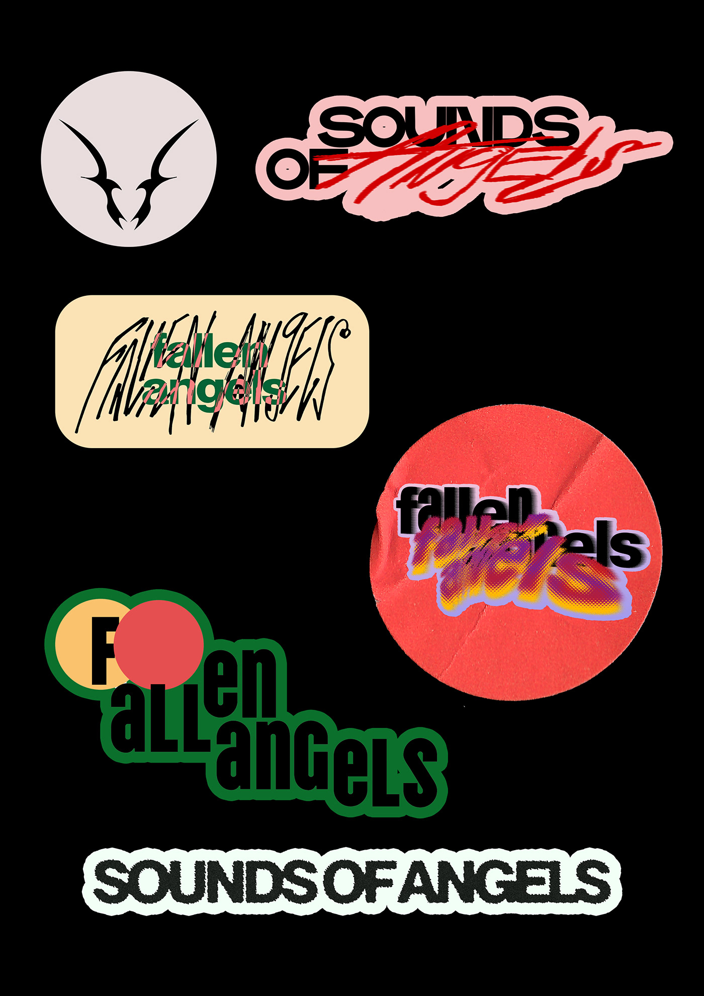
Logo Stickers


Other promotional materials
I think my work is a perfect blend between what a standard K-Pop album promotional cycle and album packaging should look like, and a playful, sometimes oddly, but very personal touch from my designing styles. Working on this project took me more time and effort than I expected but I’m quite happy about my outcome. There are obstacles in the project, such as the amount of time that I spent looking for mock-ups online, or dealing with the composition of the lyrics paper when there are too many words crammed in such a limited space. On the bright side, I think I started to show more experiment with my designs, for example, I started sketching more and even used some of the raw materials. Overall, this is my “dream come true” project because it fulfils my will to be a K-Pop album packaging designer, as well as being a remarkable milestone to see how far I’ve gone in my graphic design career.

To enjoy the full experience of the project, please visit https://www.instagram.com/fallenangels.official/


